When Jessica from Cuddles + Care reached out, I could tell right away this was a brand with heart. Her agency supports families during the first year of their baby’s life with expert overnight care — and she wanted her visuals to reflect the same warmth, professionalism, and trust she brings to every client experience. Her business was growing fast — from Vancouver roots to new expansion in Toronto — and she was ready for a fresh business logo to match.
Meet Cuddles + Care
Cuddles + Care is a night nanny agency serving families in Vancouver and Toronto with deeply supportive postpartum care. Their team of newborn specialists offers overnight support, breastfeeding guidance, and developmental insight — all delivered with a steady, calming presence that makes new parents feel held.
It’s a high-touch, premium service — but also an incredibly personal one. Jessica wanted her brand to hold space for both.
The Business Logo She Was Looking For
When Jessica came to me, she had already found a website template from Tonic Site Shop she was excited to use — but she knew the branding needed a lift. Her business had evolved, and the original business logo didn’t reflect where she was headed.
Our job? To create a brand suite for postpartum support that felt empathetic and elevated — just like the service itself.
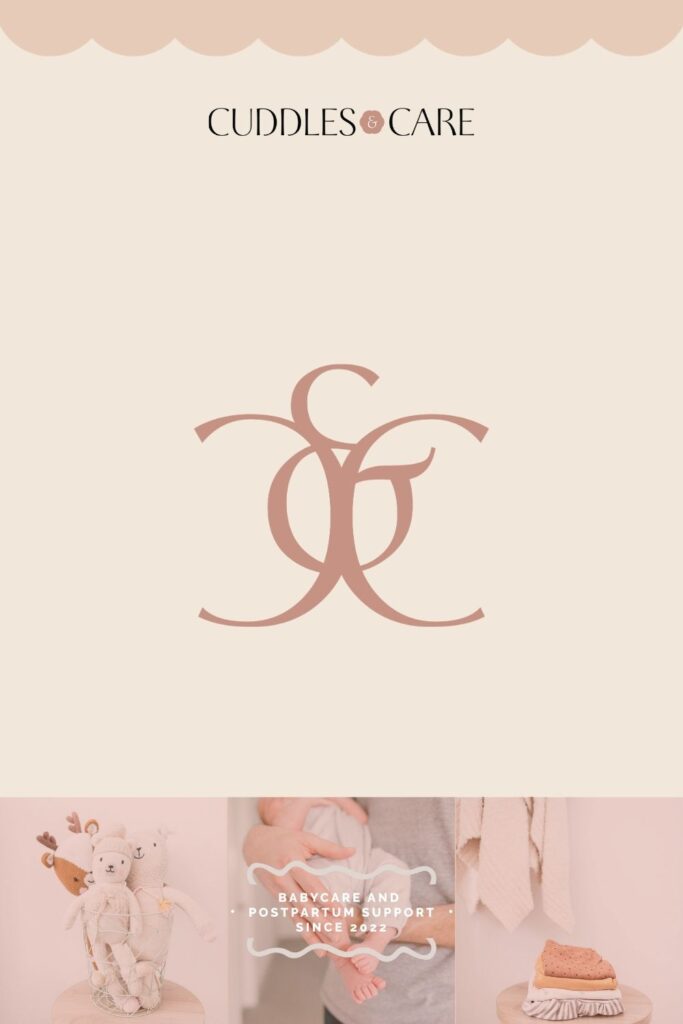
The Design Direction
I started with the feeling: safe, soft, nurturing — like a warm hug at 3am. The logo needed to reflect the heart of the agency while also giving the brand room to grow.
We chose a calligraphic sans-serif, for the primary wordmark. It’s got this lovely balance — refined but not stiff, gentle without feeling too playful. It feels like softness made visible.
I also designed supporting marks (cloud shapes, ovals, subtle curves) to carry the brand’s tenderness into every touchpoint. The whole identity is rooted in curves and flow — no sharp edges here, just care.
The Business Logo Suite We Delivered
- A custom logo suite with wordmark, secondary logo, and brand marks
- A brand style guide tying together Jessica’s existing colors + fonts
- Creative direction that helped bring clarity and cohesion to her new chapter
Jessica built her website herself using a Tonic template — and it pairs so beautifully with the branding we created.
Want to get the vibe? Explore TONIC’s Paper Plane template (affiliate link)
Why It Matters
Jessica built this agency from a place of empathy — and that comes through in every part of the business. This wasn’t about trendy branding or ticking boxes. It was about creating something enduring. Something that feels like her.
Now, when potential clients land on her website, they feel that connection immediately.
Final Thoughts
Working with Jessica on the Cuddles + Care brand was such a heart-led experience. This project is a beautiful reminder that branding isn’t just about looking polished — it’s about feeling aligned, supported, and seen. When the design holds just as much care as the service behind it, that’s when everything clicks into place.
If you’re building something special — especially in the care, wellness, or service-based space — and want your brand to reflect the heart of what you do, I’d love to hear from you.
take the free style quiz

Which Brand Style Are You? Get Insight & Actionable Ideas In Just A Few Minutes.
get the free email designs
Beautiful Flodesk Real Estate Emails That Get Noticed And Get Results

get the free templates
")
Free Instagram Canva Templates For Real Estate Brands

Behind the blog
I’m Vanessa. The Founder & Creative Director of Vanessa Bucceri Creative.
We work with ambitious service professionals who are ready to uplevel their brand identity so they can flourish in their businesses. We show style-minded business owners just like you how to connect with your audience through artful branding & web design - all while truly listening to your vision and intuitively bringing it to life.
More About VBC
If your site no longer reflects where your business is headed, a few thoughtful changes can make a meaningful difference.
This quick audit highlights what’s working, what could be refined, and where clarity would help most.

