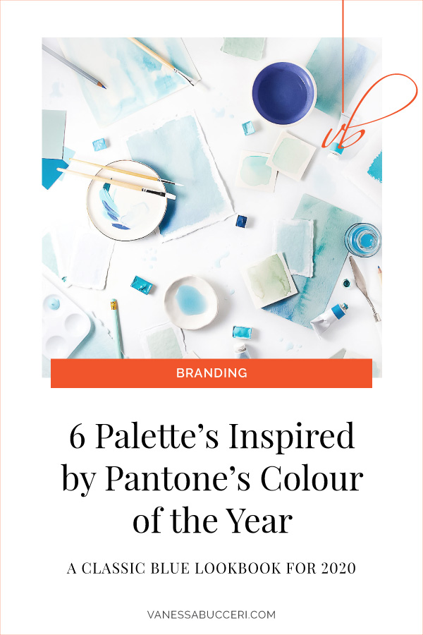
Back in December, Pantone announced their 2020 Colour of the Year selection to be 19-4052 Classic Blue.
Chosen for it’s timeless and enduring characteristics, Pantone picked this colour to bring a “sense of peace and tranquillity to the human spirit, offering refuge” as we enter a new decade.
Described as solid, reflective and dependable, Classic Blue is reminiscent of the sky just before nightfall. It “provides an anchoring foundation,” says Leatrice Eiseman, Executive Director of The Pantone Color Institute. But she continues, it also “encourages us to look beyond the obvious to expand our thinking, challenging us to think more deeply, increase our perspective and open the flow of communication.”
The Qualities of Pantone’s Colour of the Year Classic Blue in Marketing & Brand Design
In marketing and brand design, blue is a comforting and calming colour because it’s one we are so familiar with. For instance, blue is the colour of the skies and the seas. It makes you feel at ease. When used in marketing, serene blue projects honesty, loyalty and security. Therefore, it’s the perfect colour to build trust and signify strength.
Above all, what I love about this year’s choice is just how versatile Classic Blue is.
You can match it with practically any colour. For example, it’s a dependable counterpart that makes you feel at ease next to fiery red, bright saffron or raspberry pink.
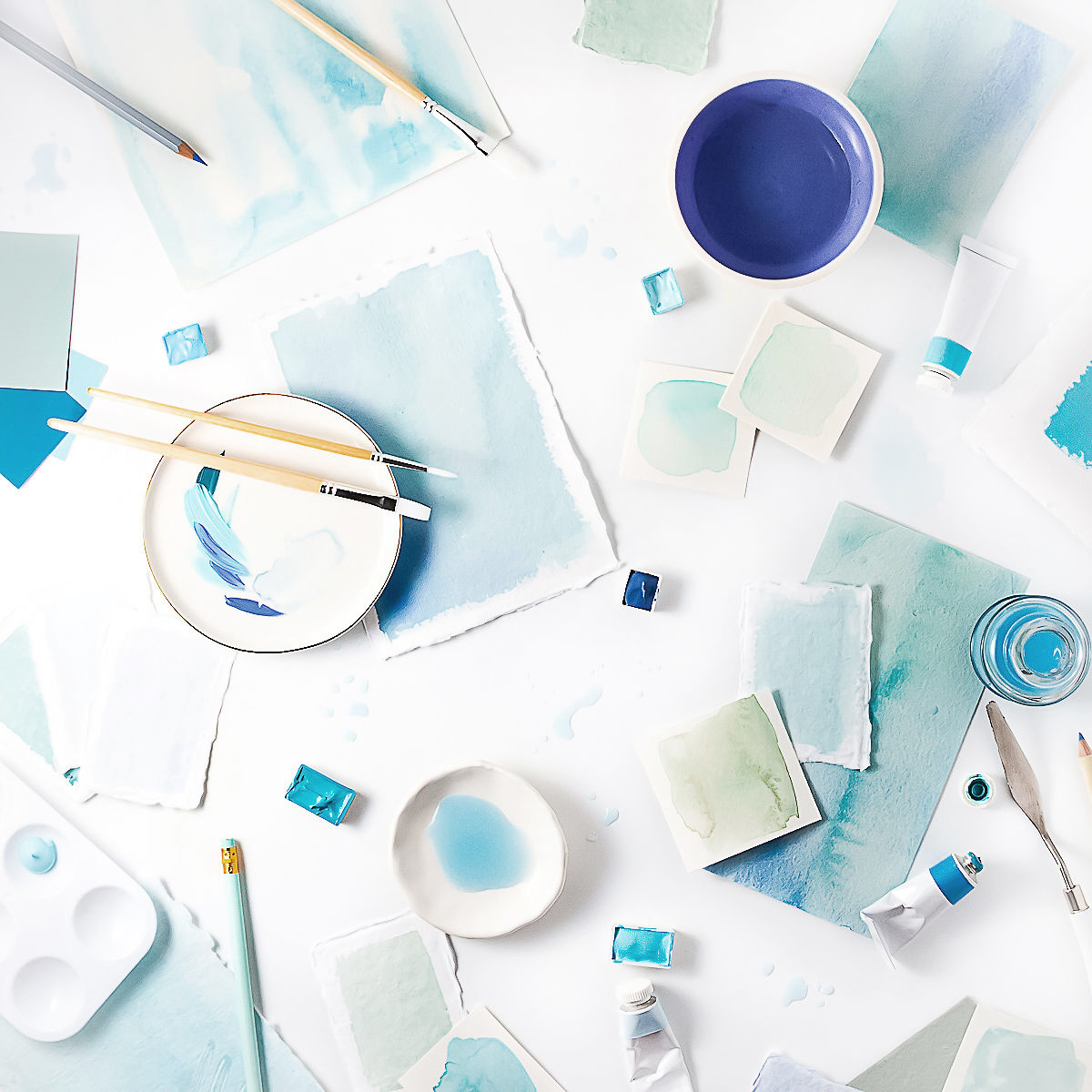
So today, I’m sharing 6 colour palettes inspired by Pantone’s 19-4052 Classic Blue. Scroll on to enjoy a classic blue lookbook for the year ahead.
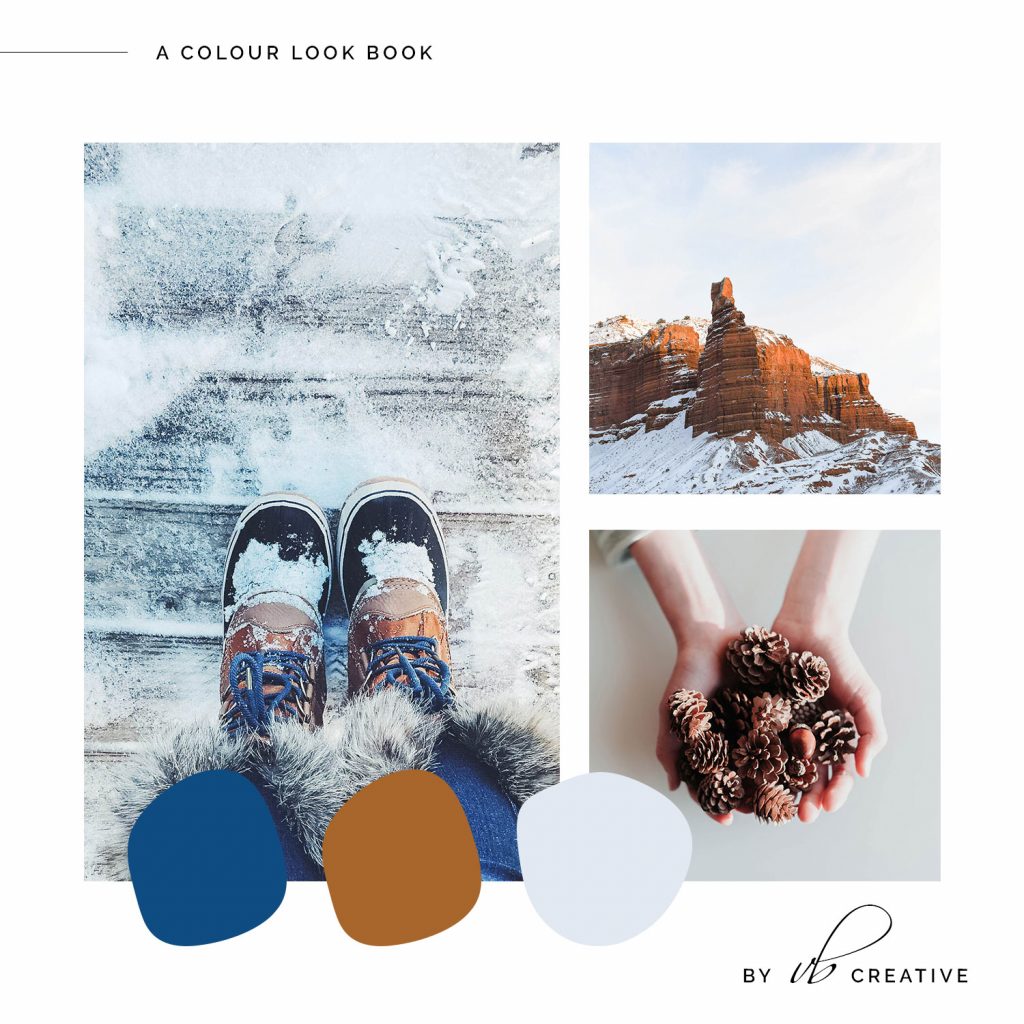
01. A Winter Inspired Classic Blue Palette
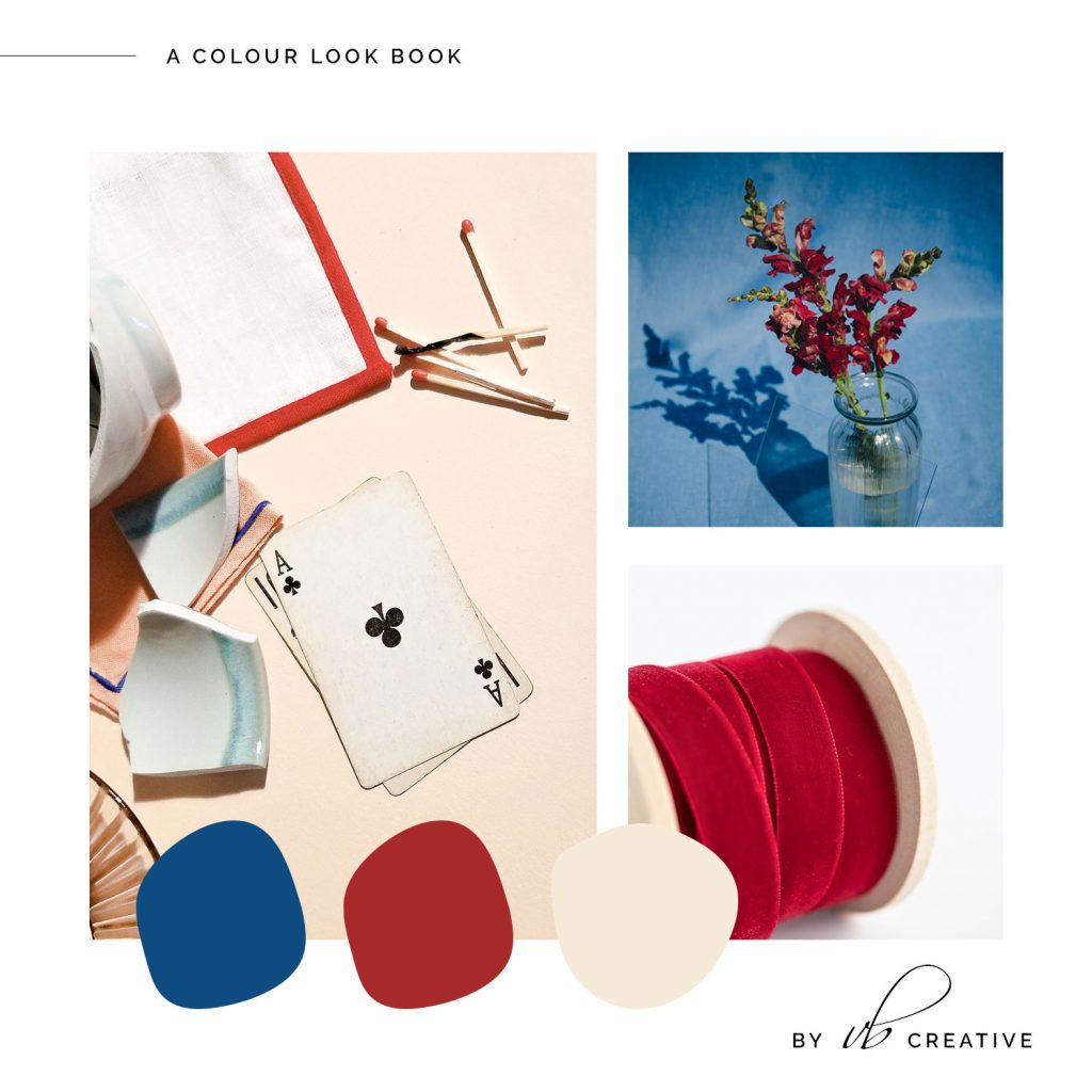
02. Rusty Red with Colour of the Year Classic Blue
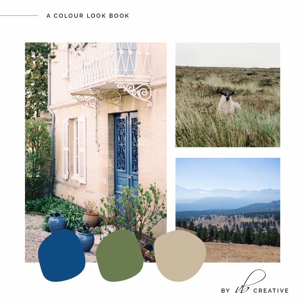
03. A Nature-Inspired Classic Blue & Olive Palette
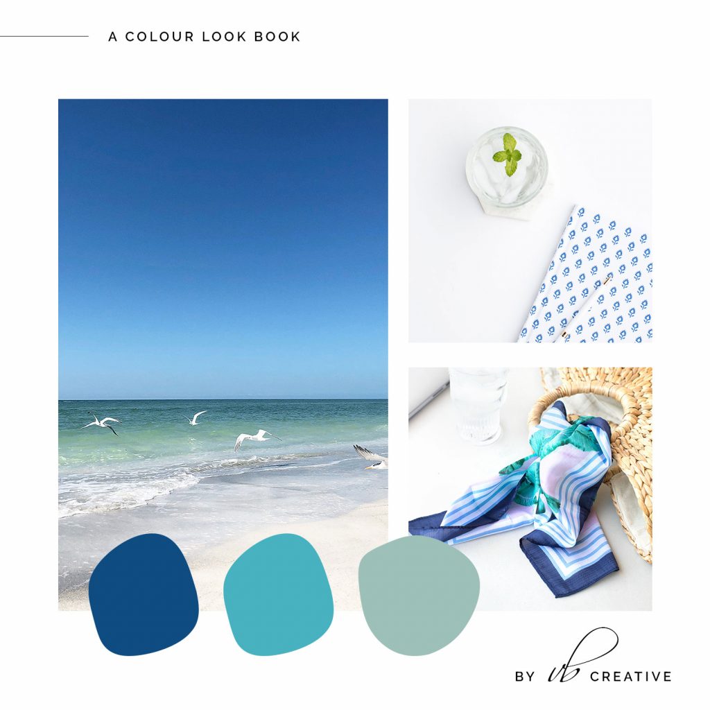
04. A Water Inspired Classic Blue Palette
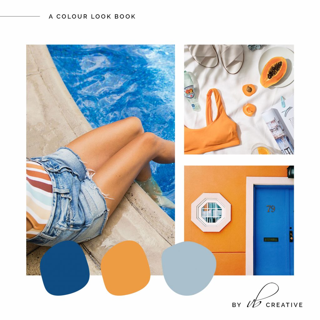
05. Colour of the Year Classic Blue with Saffron
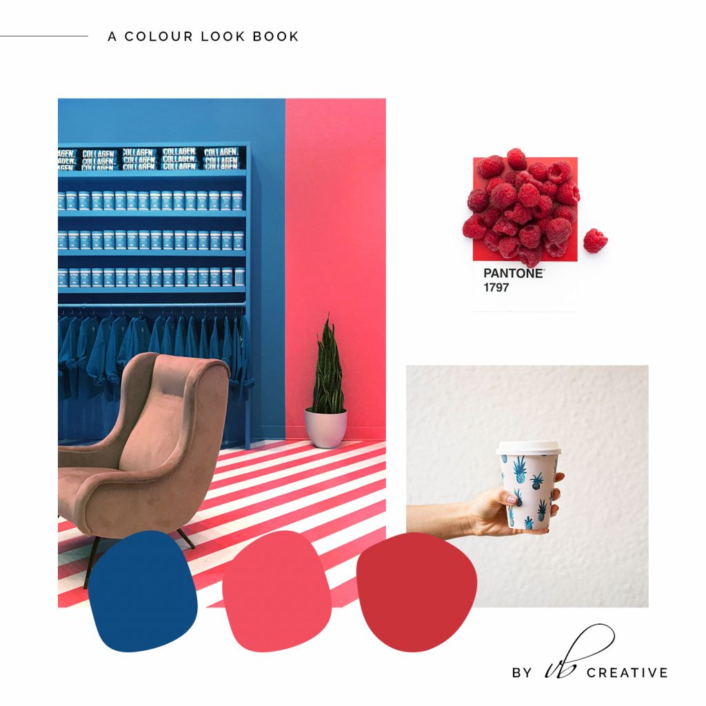
06. A Raspberry and Classic Blue Colour Palette
Looking for more branding related content? Here are more posts that may be of interest!
take the free style quiz

Which Brand Style Are You? Get Insight & Actionable Ideas In Just A Few Minutes.
get the free email designs
Beautiful Flodesk Real Estate Emails That Get Noticed And Get Results

get the free templates
")
Free Instagram Canva Templates For Real Estate Brands

Behind the blog
I’m Vanessa. The Founder & Creative Director of Vanessa Bucceri Creative.
We work with ambitious service professionals who are ready to uplevel their brand identity so they can flourish in their businesses. We show style-minded business owners just like you how to connect with your audience through artful branding & web design - all while truly listening to your vision and intuitively bringing it to life.
More About VBC
If your site no longer reflects where your business is headed, a few thoughtful changes can make a meaningful difference.
This quick audit highlights what’s working, what could be refined, and where clarity would help most.

