Last week we launched the new branding and web design for KH Masonry. I’m so excited to share all the project details with you here!
KH Masonry Branding
The Design Inspiration
For this project, we were after an honest and trustworthy design. The branding for KH Masonry had to reflect their quality workmanship and craftsmanship. This South Surrey-based business firmly believes in doing a quality job in an enthusiastic and professional manner.
Their brand promise is service with skill, integrity and enthusiasm. To visually showcase these characteristics, I pulled from the materials and patterns of the bricklaying trade.
Also, we drew inspiration from beautiful, classic masonry work you would typically see on the east coast or in the UK. Think beautiful entryways, classic English topiaries, perfectly aligned brick patterns and of course herringbone.

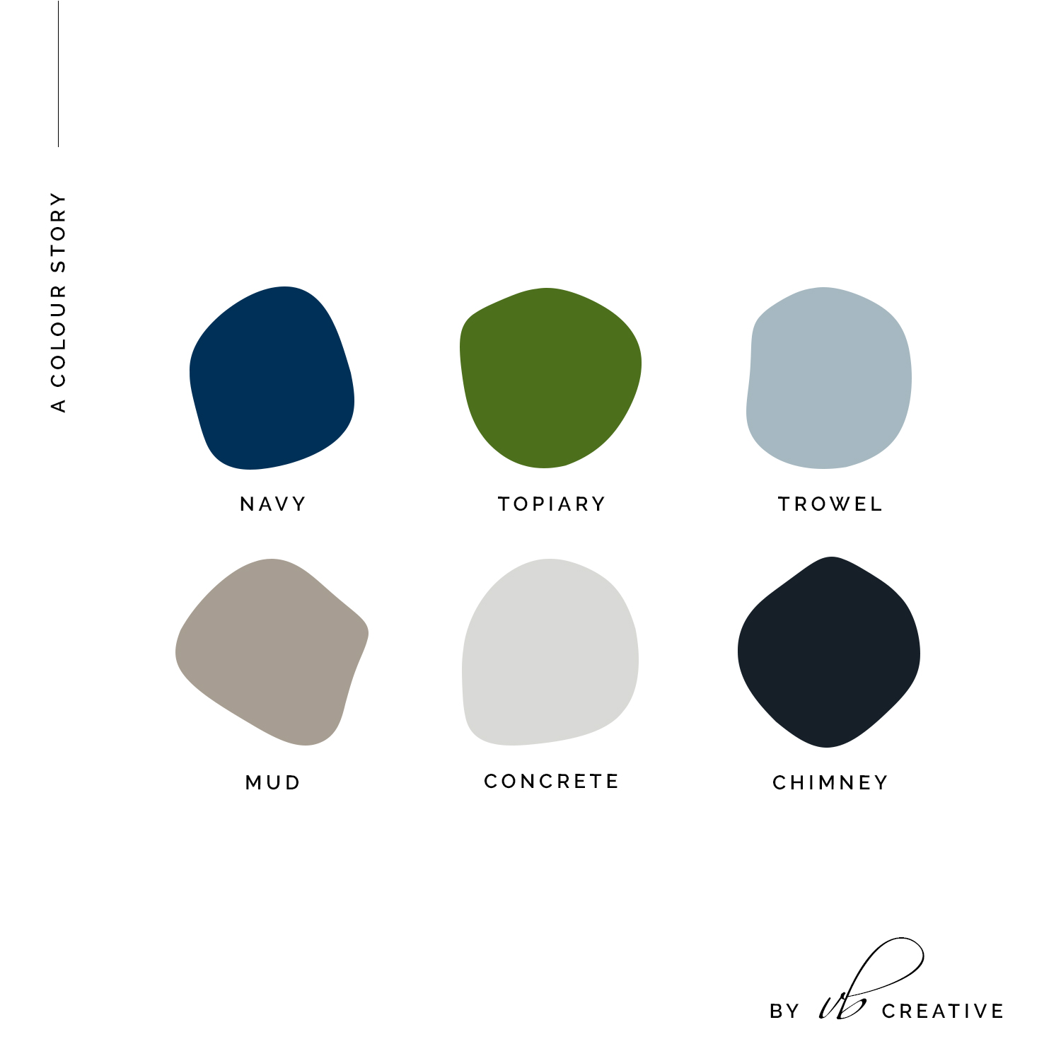
KH Masonry Branding: The Colour Palette
Likewise, the colour palette was inspired by natural stone and enhanced with a deep navy blue. A fresh topiary green was added for depth and extra interest.
KH Masonry Branding: The Logo Design With Alternates & Iconography
Here is the full wordmark logo design. My favourite detail is the slab serif font – the perfect choice for a masonry brand. The feet of the characters look like they are finished in brick.
Perhaps most importantly, we had to take full advantage of some gorgeous brick laying patterns. They were incorporated into the final design as icons, favicon and accents. By far my favourite has to be the herringbone pattern in the example below.
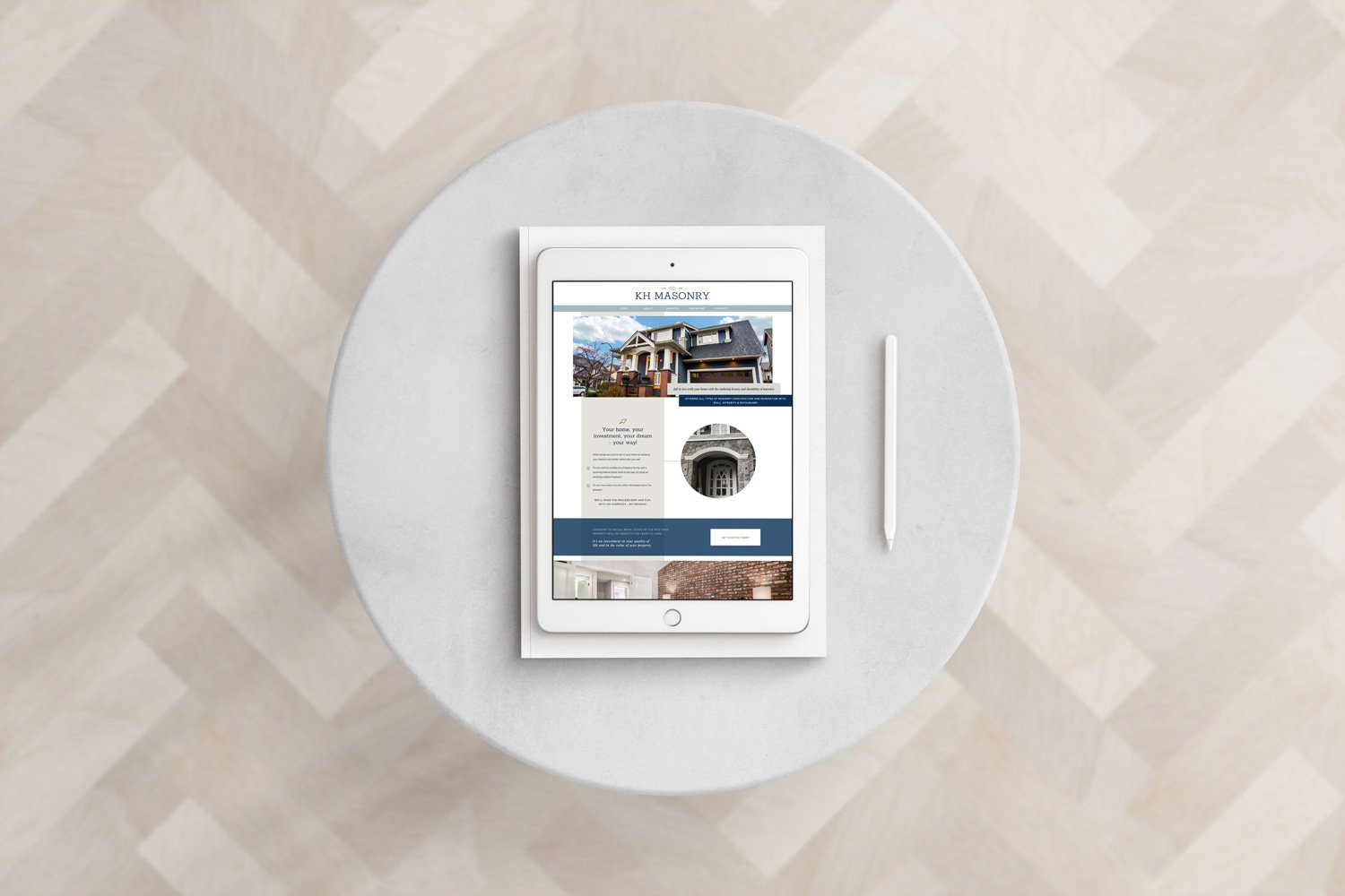
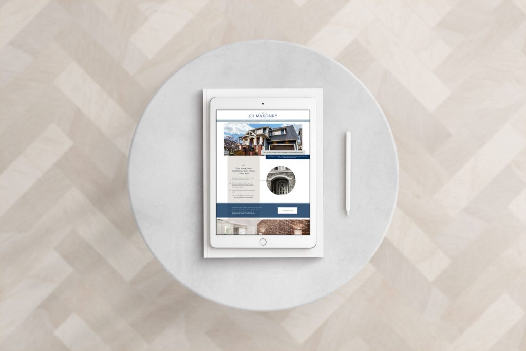
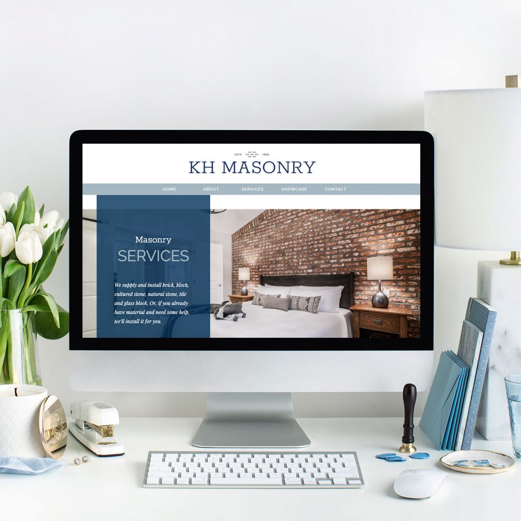
The New Showit Website Design
Meanwhile, for the website design, we customized my Showit template Figurati. Figurati was the perfect selection because it was made with interior designers in mind. As a result, it was a gorgeous starting off point for this web design.
Shop the Showit Template Collection here.
The client’s copywriting and stunning imagery really helped pull everything together so nicely. For instance, here is the new homepage design for KenTheMason.com.
Curious to see more? Go visit the new website here!
take the free style quiz

Which Brand Style Are You? Get Insight & Actionable Ideas In Just A Few Minutes.
get the free email designs
Beautiful Flodesk Real Estate Emails That Get Noticed And Get Results

get the free templates
")
Free Instagram Canva Templates For Real Estate Brands

Behind the blog
I’m Vanessa. The Founder & Creative Director of Vanessa Bucceri Creative.
We work with ambitious service professionals who are ready to uplevel their brand identity so they can flourish in their businesses. We show style-minded business owners just like you how to connect with your audience through artful branding & web design - all while truly listening to your vision and intuitively bringing it to life.
More About VBC
If your site no longer reflects where your business is headed, a few thoughtful changes can make a meaningful difference.
This quick audit highlights what’s working, what could be refined, and where clarity would help most.

