I’ve been working on a few new projects as of late and coming across some really beautiful Google font combinations. Today I wanted to share my current faves with you and how to use them in your next graphic or website design project!
For those of you that are new to Google Fonts, it’s a great library of free to use web fonts. You can download the files for use on your website or many web builders link automatically to this resource.
Even if you can access the font library through your web builder, I do recommend heading over to the Google Fonts website. It has great filters to aid your search for the perfect font plus it will recommend complimentary pairings.
5 Beautiful Google Font Combinations for Your Unique Brand
Combining fonts is definitely an art and the more I do it, the more I love admiring the nuances to find the perfect pair. Finding the perfect pair is just the beginning. Font details like size, colour, spacing and weight can all change the look of the overall combination in subtle and striking ways.
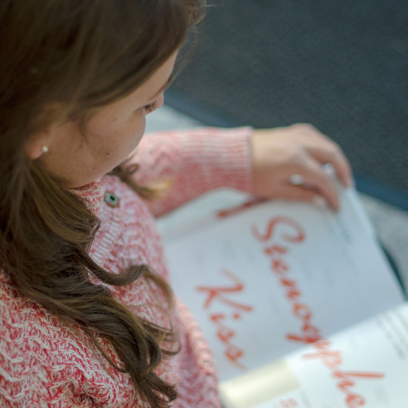
01. Google Font Pairing Italiana with Montserrat Light

Italiana is an elegant and flirty font inspired by Italian calligraphy. It is perfect for use in headings and subheadings. Each character or glyph is fairly wide which is why I like it paired with modern Montserrat. Both fonts also have a large “x-height” meaning the lower case letters are fairly tall in comparison to the height of the Upper case characters. Montserrat is a very versatile font, available in multiple weights. It’s also clean and easy to read which makes it a popular choice for body or paragraph text.
Four other Italiana font pairings
- Italiana with Mulish
- Italiana with Manrope
- Italiana with Quicksand
- Italiana with Nunito
Fonts similar to Italiana
For other fonts like Italiana try Haboro Contrast Cond Light or Freight Neo Cnd Pro Light. Both are available currently through Adobe fonts.
02. Google Font Pairing Oranienbaum with PT Sans Narrow

Oranienbaum is a confident and trustworthy choice. Its narrow characters are a modern take on the traditional serif font. I’ve paired it with another narrow choice like PT Sans Narrow which is clean and easy to read in paragraph form.
See how I’ve used Oranienbaum on this Squarespace web design for Marsha Kwasnicki Portraiture with Brandon Grotesque.
03. Google Font Pairing Tenor Sans with Cormorant Infant

Tenor Sans is a feminine sans-serif choice. I like that the characters have some variation in thickness which adds a soft and cheerful detail. I also love the height of the lowercase letters which are taller than they are wide.
I’ve picked the lovely Cormorant Infant which compliments Tenor Sans nicely. One of my favourite features of Cormorant is the bulbous terminals, or endpoints, on the glyphs. Take a closer look at the end of the f or s to see an example.
Four other tenor sans font pairings
- Tenor Sans with Futura – as seen on this Shopify website for Just Flooring.
- Tenor Sans with Open Sans and Olivie Script Regular for accent – as seen in the branding for Real Estate Agent Joanne McCrone. Check it out on my portfolio or visit Joanne’s site directly here.
- Tenor Sans with Work Sans
- Tenor Sans with Karla
Fonts similar to Tenor Sans
For other fonts like Tenor Sans try Figura Sans by Jen Wagner which you can see in use on our project for South Rock Real Estate Group. Also, Utile Display is stunning for headlines as seen on the website for Noyo Creative Co.
04. Google Font Pairing Federo with Oswald Light

Federo is a graphic and bold font choice. It evokes confidence and style so is perfect for a brand looking for a distinct font. I’ve paired it here with Oswald which is another bold choice. When used in heavier weights, Oswald makes a strong impression. I like it here in the lighter weight so it doesn’t steal all the attention from the angular Federo.
05. Google Font Pairing Marcellus with Libre Baskerville

Marcellus is another graphic and crisp choice for headings and subheadings. It would also look great as a wordmark logo. I love the slight flare on the characters. This is a serif font by definition but because it’s so subtle the result is refined and charming. I love it as a font combination with another pretty serif and have chosen Libre Baskerville here.
Four other Marcellus font pairings
- Marcellus with Alegreya Sans – as seen on the live website redesign for Hamilton Fabbro. Here it’s paired with a humanist sans serif, Alegreya Sans.
- Marcellus with Karla for paragraph copy is also a great pairing
- Marcellus with Roboto and Roboto Mono
- Marcellus with Manrope
Fonts similar to Marcellus
Utile Display is a great alternative to Marcellus. You can see it in use on the website for Noyo Creative Co. Fonts Freight Neo Pro and Cora Regular are also like Marcellus. All three of these alternatives are available with Adobe fonts.
FAQs About Google Font Combinations
What fonts pair well together?
Fonts pair well when they balance contrast and harmony. A bold serif headline paired with a clean sans-serif body font is a classic example. The key is creating readability without losing personality.
What are some trendy Google Fonts?
“Trendy” fonts change every year, but the best approach is to choose timeless combinations that still feel fresh. That’s why I release a seasonal lookbook with curated font pairings, colour palettes, and style directions. It’s the perfect balance of what’s current and what lasts. See the latest seasonal lookbook.
What are some elegant Google Fonts?
Elegant Google fonts often combine timeless serifs with modern readability. The ones listed above are a great starting point. Some of my other favourites for a classic, high-end look are Newsreader (used in the Adrian George website), Libre Baskerville (featured on Pacific Family Dental), DM Serif Display, Prata, and Fraunces. These pair beautifully with refined sans-serifs to create a polished, professional brand.
Looking for more font combinations?
Check out these related posts:
6 Fierce and Elegant Serif Fonts for a Really Unique Brand Look
What Is a Mood Board and Why Are They Important?
Fonts are just the start… when combined with colours, textures, and layout, they create a polished online space. Every website project in my studio comes with a curated seasonal lookbook to make those decisions easy. Explore our Studio Collection of branding and website design services.
take the free style quiz

Which Brand Style Are You? Get Insight & Actionable Ideas In Just A Few Minutes.
get the free email designs
Beautiful Flodesk Real Estate Emails That Get Noticed And Get Results

get the free templates
")
Free Instagram Canva Templates For Real Estate Brands

Behind the blog
I’m Vanessa. The Founder & Creative Director of Vanessa Bucceri Creative.
We work with ambitious service professionals who are ready to uplevel their brand identity so they can flourish in their businesses. We show style-minded business owners just like you how to connect with your audience through artful branding & web design - all while truly listening to your vision and intuitively bringing it to life.
More About VBC
If your site no longer reflects where your business is headed, a few thoughtful changes can make a meaningful difference.
This quick audit highlights what’s working, what could be refined, and where clarity would help most.

